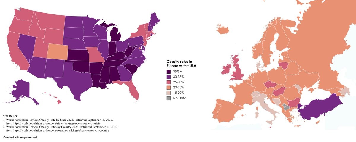
@scarlett_sObesity rate in Europe vs USA.
Voir la publication d'origine@scarlett_sObesity rate in Europe vs USA.
Voir la publication d'originePhoto de @scarlett_s· Sep 13, 2026· News
The image displays two choropleth maps comparing obesity rates in Europe and the USA. The maps use a color gradient to represent different percentage ranges of obesity. The USA map shows a significant number of states in darker purple, indicating higher obesity rates, while Europe shows more states in lighter shades of orange and pink. A legend on the right side of the image explains the color coding for obesity rates from 15-20% to 35%+. The bottom left corner has a watermark that reads "Created with mapchart.net".
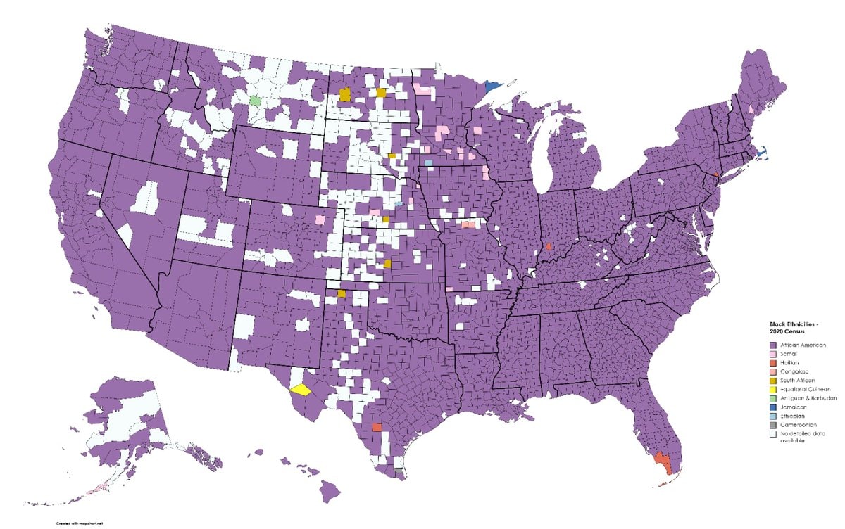 Black ethnicity by US county
 2His & Hers Netflix ranking 2026
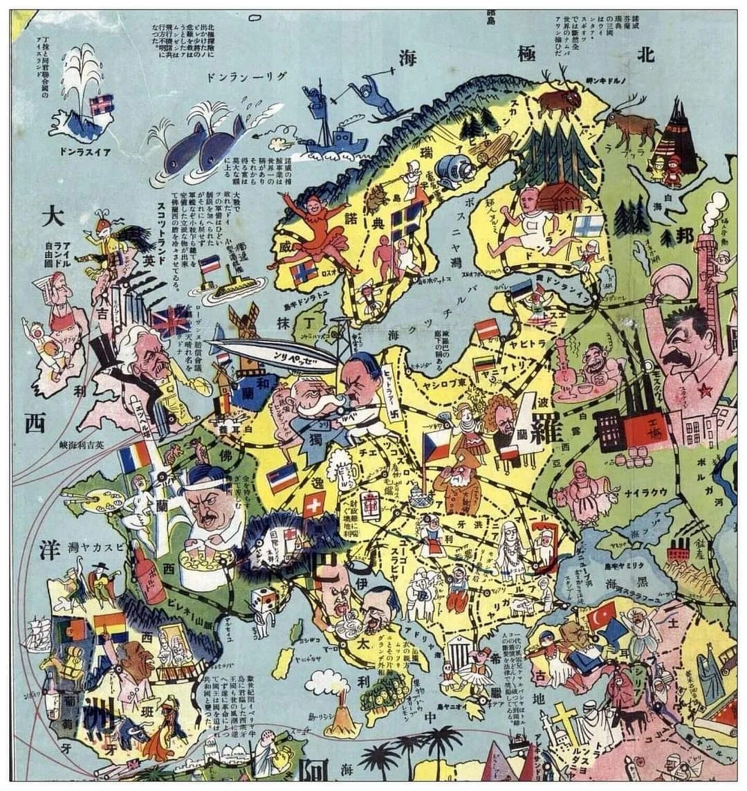 1932 Japanese map of Europe
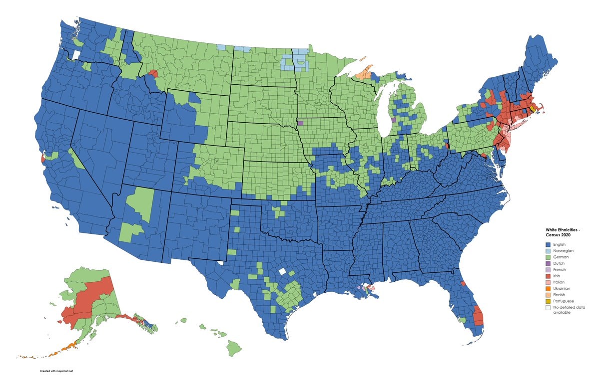 white ethnic groups by U.S. county
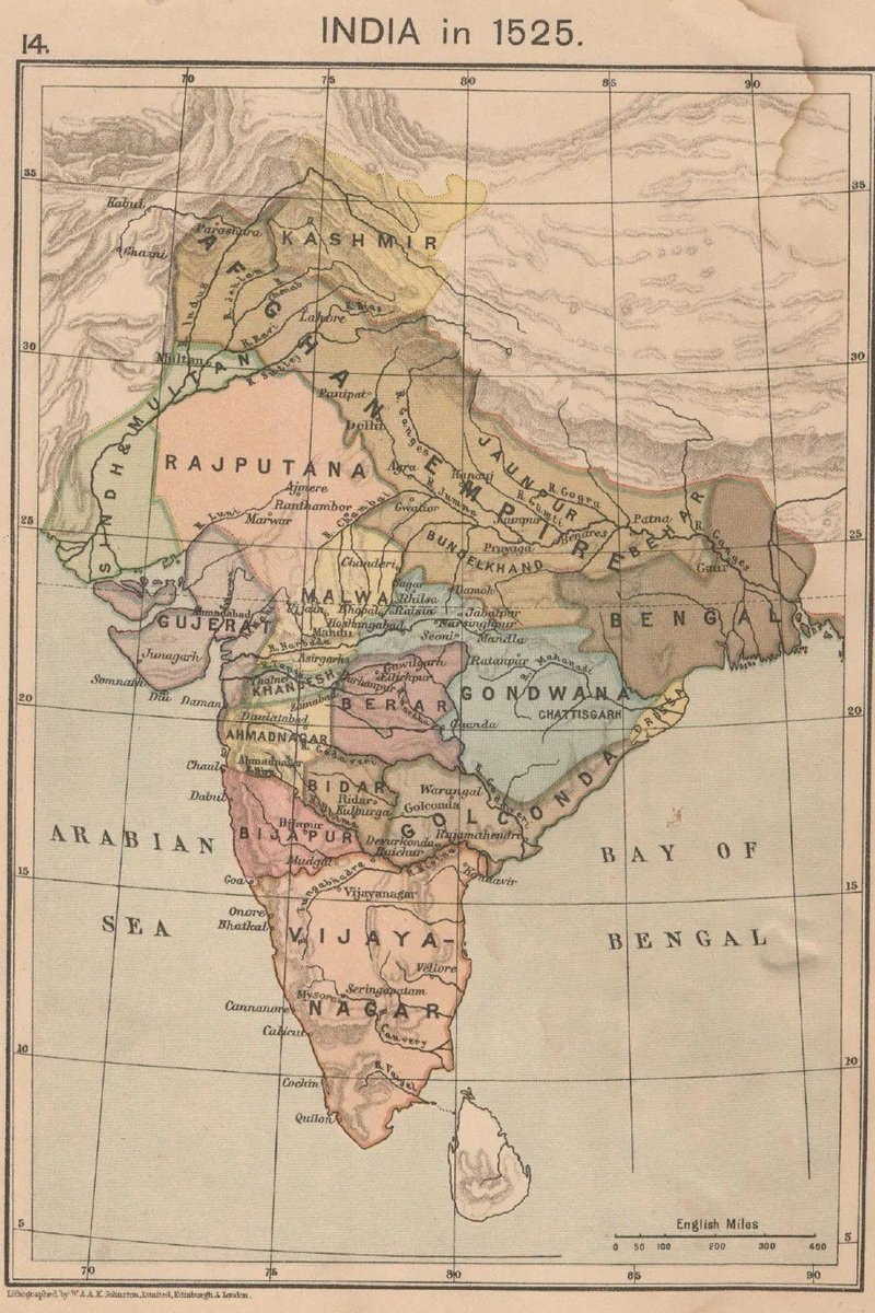 India 1525 historical map
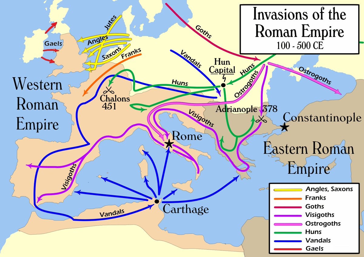 Invasions of the Roman Empire 100–500 CE
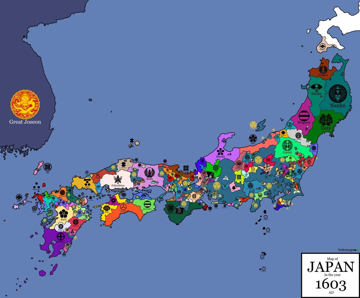 Japan 1603 map
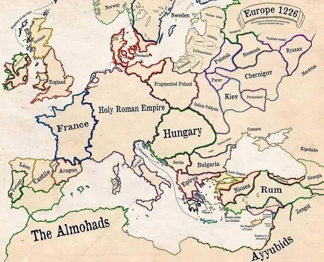 Europe in 1226
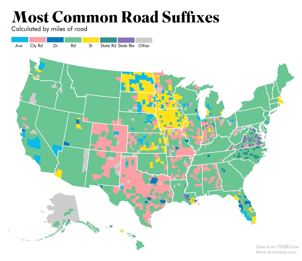 most common US road suffixes by county
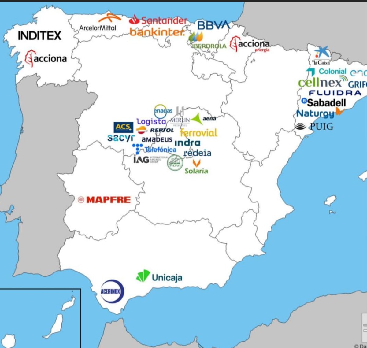 Major companies based in Spain
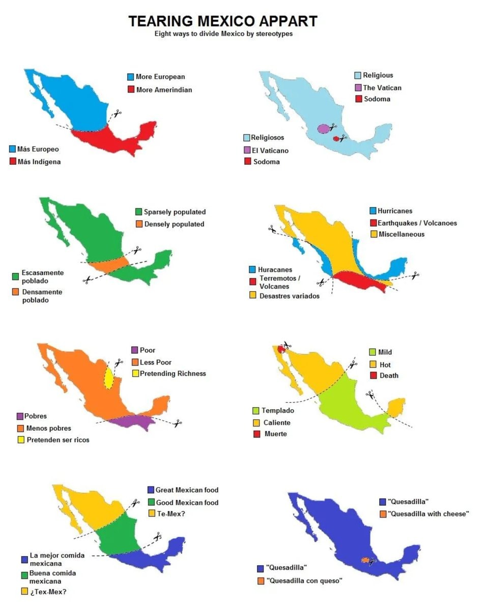 8 ways to divide Mexico by stereotype
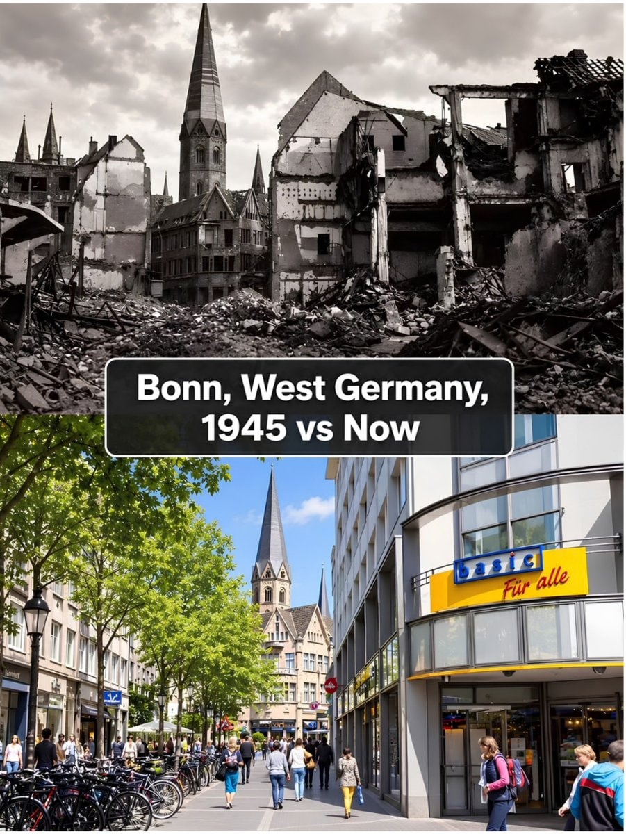 Bonn 1945 vs present day comparison
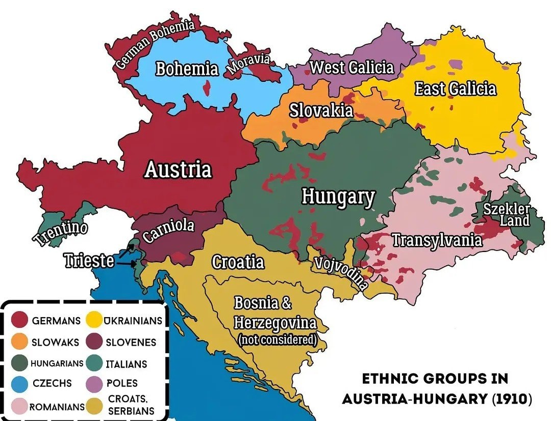 Austria-Hungary ethnic map 1910
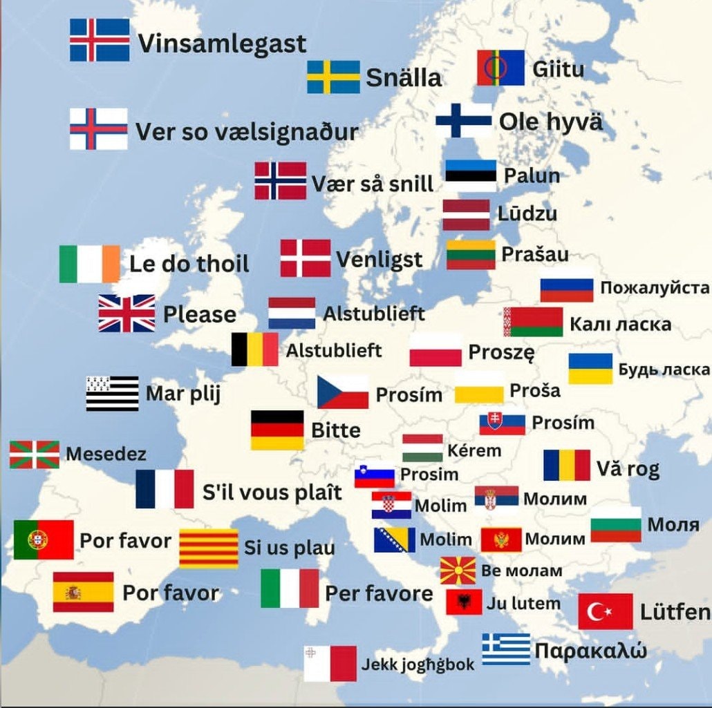 How to say Please in Europe
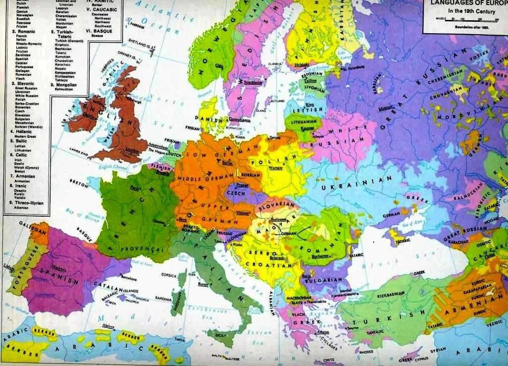 Languages of Europe map after 1882
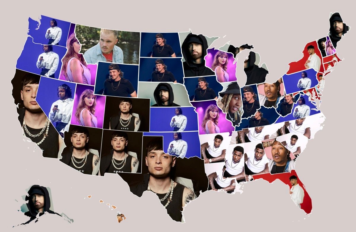 Most streamed artists by U.S. state
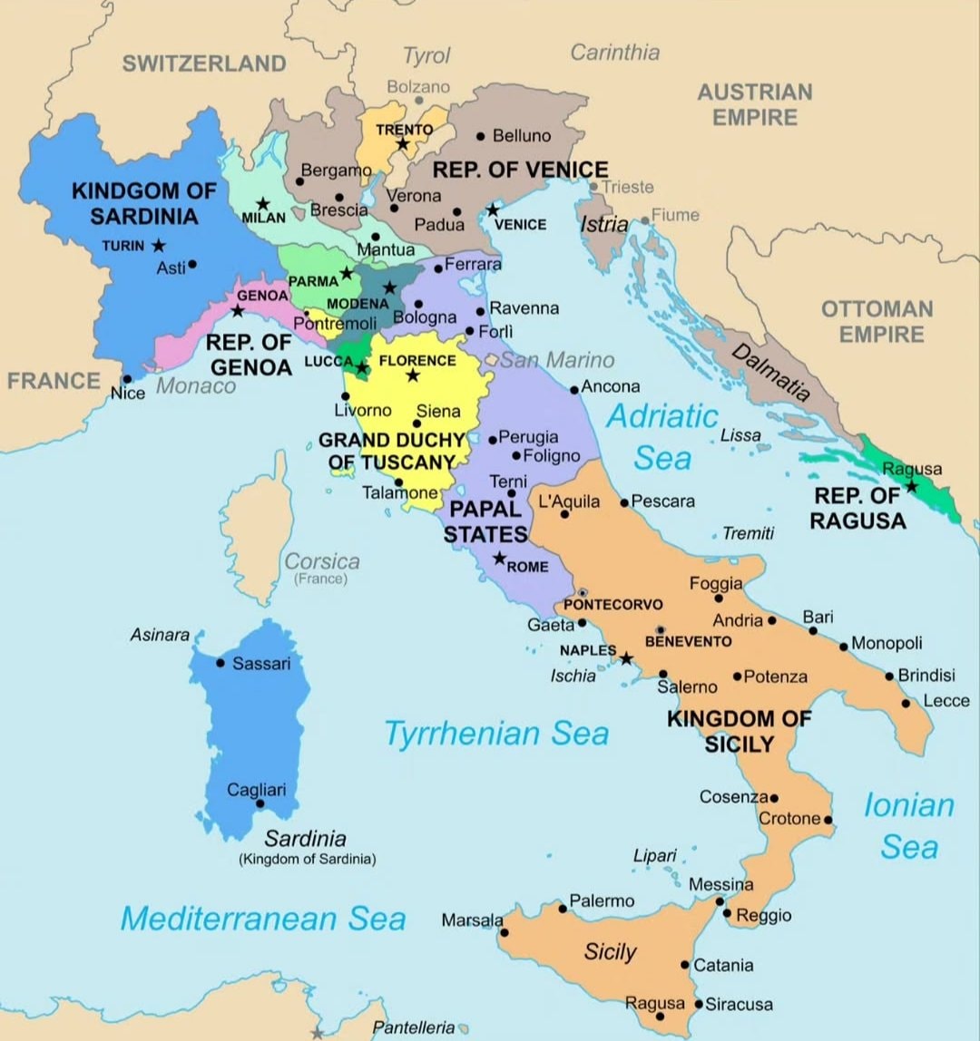 Italy map 1796
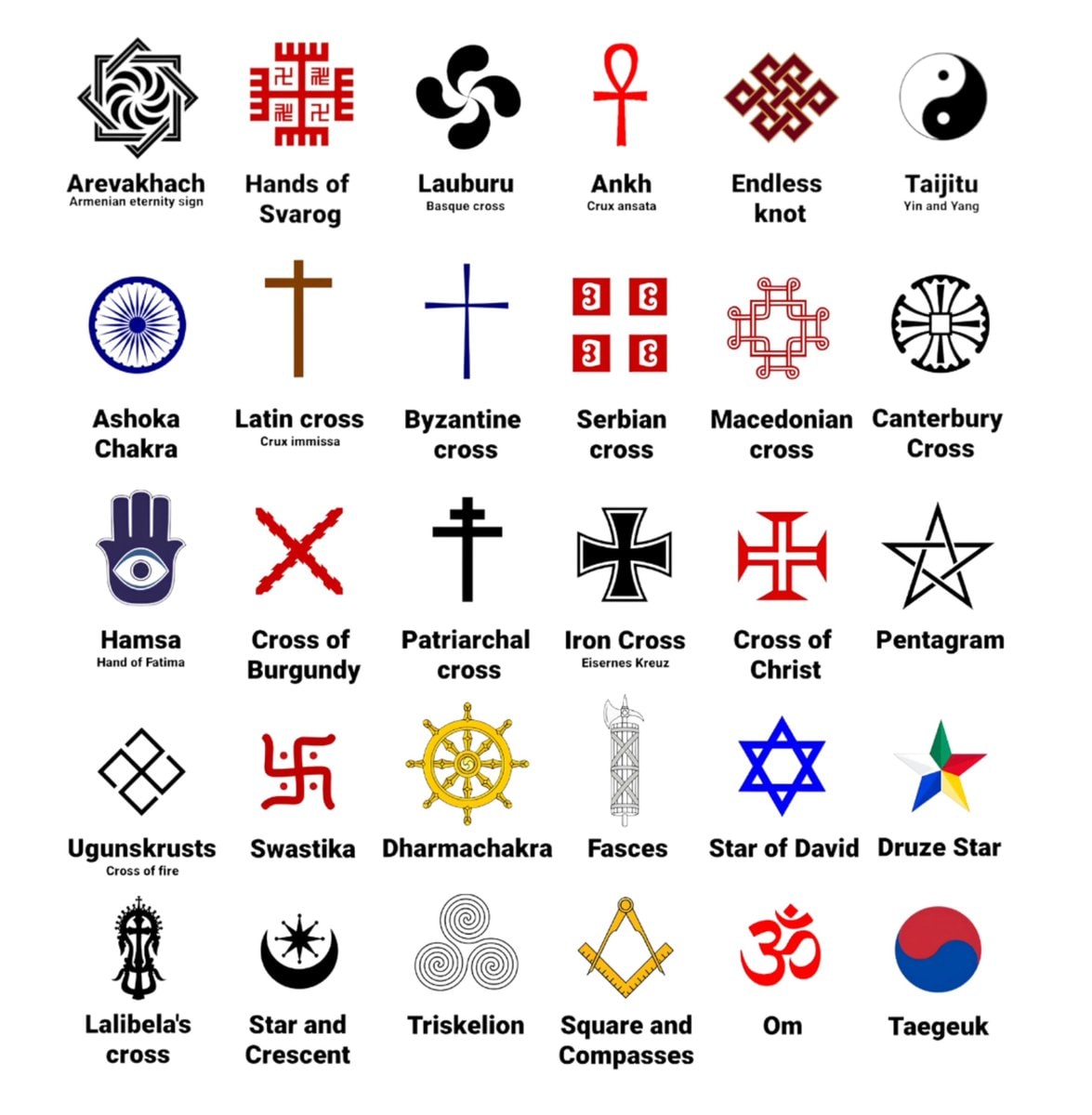 global cultural symbols grid
@scarlett_sObesity rate in Europe vs USA.
Voir la publication d'originePhoto de @scarlett_s· Sep 13, 2026· News
The image displays two choropleth maps comparing obesity rates in Europe and the USA. The maps use a color gradient to represent different percentage ranges of obesity. The USA map shows a significant number of states in darker purple, indicating higher obesity rates, while Europe shows more states in lighter shades of orange and pink. A legend on the right side of the image explains the color coding for obesity rates from 15-20% to 35%+. The bottom left corner has a watermark that reads "Created with mapchart.net".
Black ethnicity by US county2His & Hers Netflix ranking 20261932 Japanese map of Europewhite ethnic groups by U.S. countyIndia 1525 historical mapInvasions of the Roman Empire 100–500 CEJapan 1603 mapEurope in 1226most common US road suffixes by countyMajor companies based in Spain8 ways to divide Mexico by stereotypeBonn 1945 vs present day comparisonAustria-Hungary ethnic map 1910How to say Please in EuropeLanguages of Europe map after 1882Most streamed artists by U.S. stateItaly map 1796global cultural symbols grid